It’s no secret that 2016 has been filled with more twists and turns than anyone can handle. Whether we’re debating the impact of Kermit memes, or mourning the apps we’ve lost (RIP Vine), the question of identity has been at the forefront of this year. Who am I? Where am I going? Do I deserve the guac on my Chipotle? We’ve all asked ourselves these questions and brands are no exception. As a result, we’ve compiled a list of what KOI says are the best and worst new logos of 2016.
We Say: We see you.
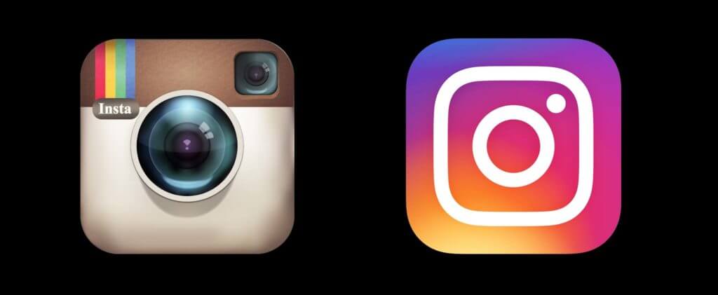
You know it, you love it, or you hate that you love it. We’re starting off the list with one of the most dramatic logo changes of 2016: Instagram. The app took users by surprise when it changed its original look for a brighter, flatter appearance. While the Koi team was taken aback at first too, we’ve learned to embrace change and love the bright gradient background. After all, Instagram is no longer a single app. Now it has matured into a photographic hub with the addition of Boomerang, Layout, HyperLapse and Story. Despite the initial criticism from users, the new logo makes the app reflect the robust family of apps and features Instagram now is.
Guinnes
We Say: Nailed it.
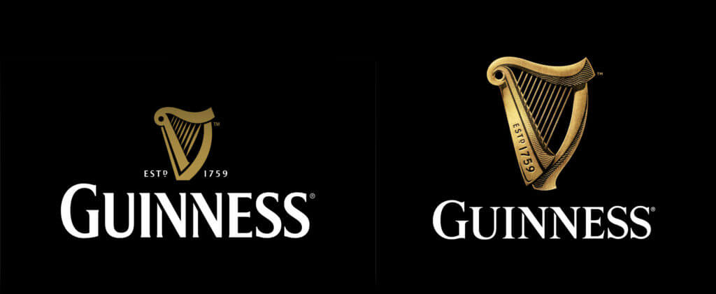
In 2016 Guinness brought to light the importance of staying true to a brand’s roots. While so many companies are jumping on the “minimalist” train, Guinness adorned their appearance with more details instead. The newly added gold shine paired with dramatic shadow provides a more 3D look and reflects the richness of a Guinness beer, making the brand feel both grand and refreshing. This year, Guinness taught us an important lesson on the power of the logo. You don’t need to spend big money on creating a new brand identity. Sometimes a new take on what you already have, even when it strays from trends, is the way to go. Thanks for the reminder, Guinness.
Uber
We Say: …I guess?
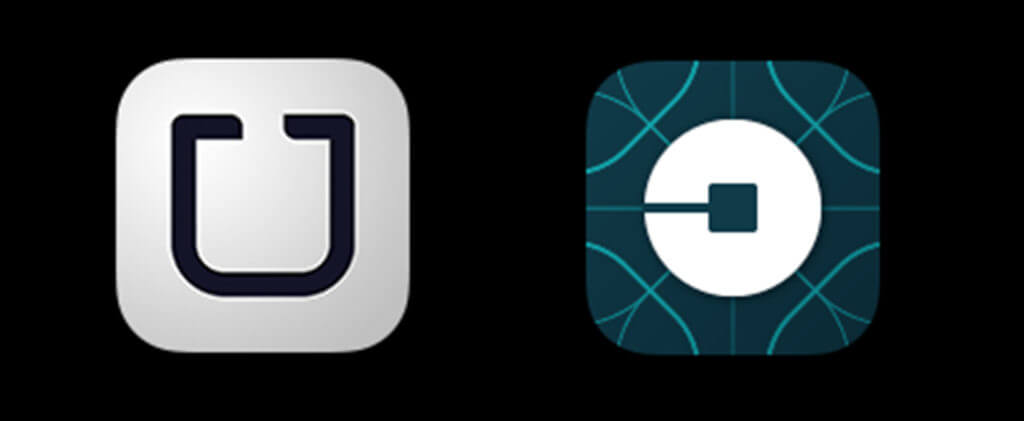
Taking the public by surprise, Uber unveiled their new logo earlier this year with a look that is, well… we’re not sure exactly what to think about it. According to Uber, the new logo is supposed to reflect a “bits and atoms” concept to represent the relationship between the software and their users, but its execution is questionable. The average Uber passenger isn’t looking to invest themselves in this grand abstract story Uber’s San Francisco headquarters concocted; they’re looking for clear, efficient and reliable transportation. We’ll say that again: clear, efficient and reliable. Three words their new logo is not. This is a classic case of a marketing team getting too caught up in an elaborate brand story no one understands or quite frankly even cares about. If you have to explain a logo, it doesn’t work.
Netflix
We Say: Nailed it.
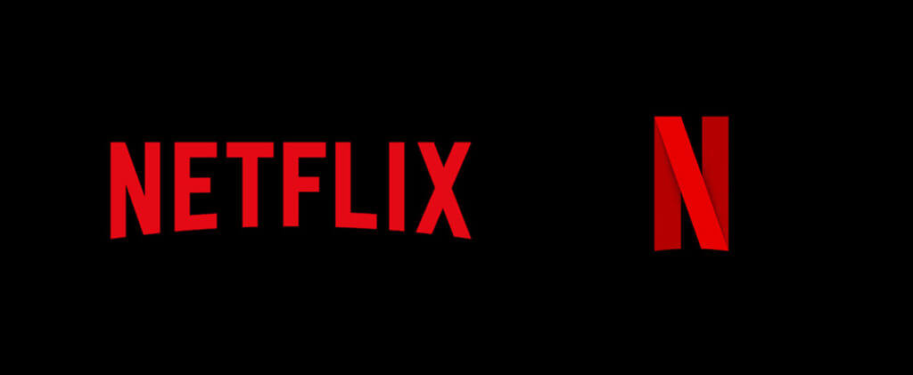
Say what you want, but it’s clear we may have a type. Brands that don’t completely overhaul their identity often have the advantage. Netflix is another example of refreshing your look while enhancing, rather than abandoning, your foundation. Earlier this year, the video-streaming powerhouse introduced the new ribbon-esque “N” logo that gives a modern nod to movie reels. While the “N” isn’t designed to replace the existing logo, which shows the entire name, the company shows that sometimes you can add to your personality as long as you keep it consistent. Good for you, Netflix.
In conclusion: Many times less is more. Stay true to your brand, but don’t get too caught up in the details. Remember to think like your customers and consider if this logo will actually translate for them or leave them lost and confused.
___________________________________________________________
Mateo Quintero
Mateo is an exceptional Art Director with a keen eye for building brands through clean and cohesive design. His expertise ranges across illustration, graphic design, UX/UI design, branding and creative ideation. Having worked on both local and global campaigns, Mateo is able to draw upon his vast range of experience to help brands flourish in fast-moving world.